Data Visualizations from Research Internship at TU Berlin
During my research internship at TU Berlin, I embarked on a diverse array of projects, leveraging geospatial data, historical records, and modern technology to produce impactful visualizations across different domains. From analyzing seismic activity to digitizing century-old maps, each project pushed the boundaries of data interpretation, offering valuable insights for urban planning, environmental conservation, and public safety. My goal was to transform complex datasets into clear, actionable visuals that could drive meaningful change and innovation in various sectors.
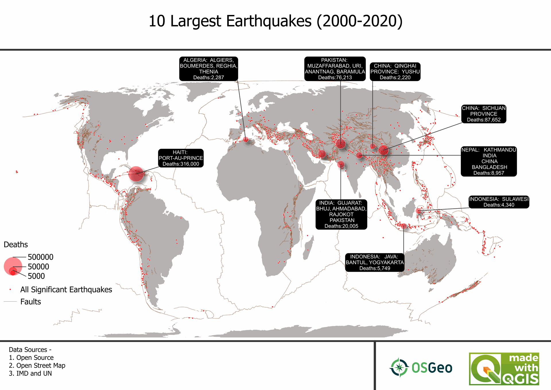
1. Big Shakers: The World's Top 10 Earthquakes (2000-2020)
Mapped and analyzed seismic activity of the top 10 earthquakes over 20 years, visualizing the profound impact these natural events have had on global communities. This project highlighted the power of geospatial tools in understanding the Earth's movements.
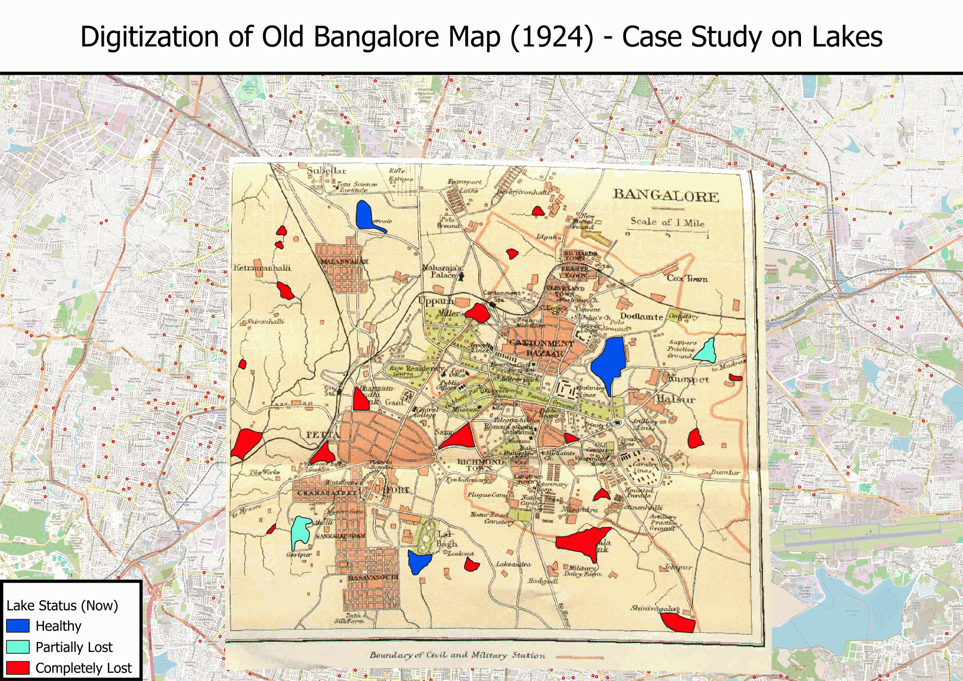
2. From Vintage to Virtual: Digitizing Bangalore's 1924 Map
Revived a century-old map of Bangalore’s lake systems and compared it with modern-day water bodies, unveiling drastic urban changes and water resource management issues over time. This research contributed to ongoing discussions on water conservation.
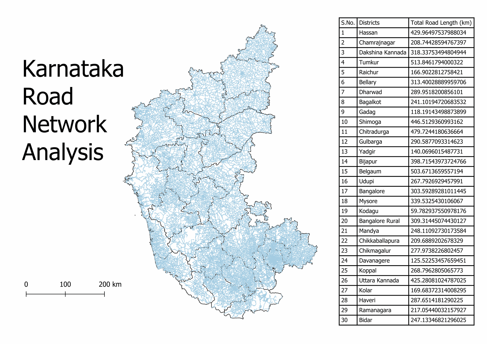
3. Karnataka's Road Network Uncovered: District-Wise Length Breakdown
Produced a detailed breakdown of road lengths across Karnataka's districts, making it easier to analyze infrastructure development and its socio-economic implications. This visualization aids policymakers in understanding transportation trends.
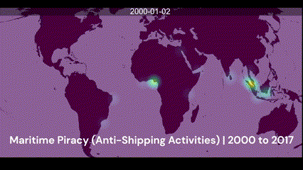
4. High Seas Drama: Mapping Maritime Piracy (2000-2017)
Mapped and visualized global piracy activities and anti-shipping incidents, providing a comprehensive view of how maritime security evolved over nearly two decades. This project helped shine a light on regions requiring heightened attention.
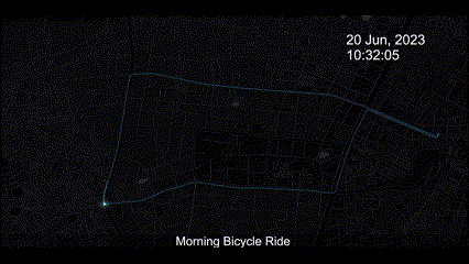
5. Pedal Power: Visualizing My Morning Bicycle Route in Berlin
Used personal cycling data to create a dynamic visualization of Berlin’s cycling infrastructure, offering insights into safe, efficient routes for urban commuters. Demonstrated the role of everyday data in optimizing urban mobility.
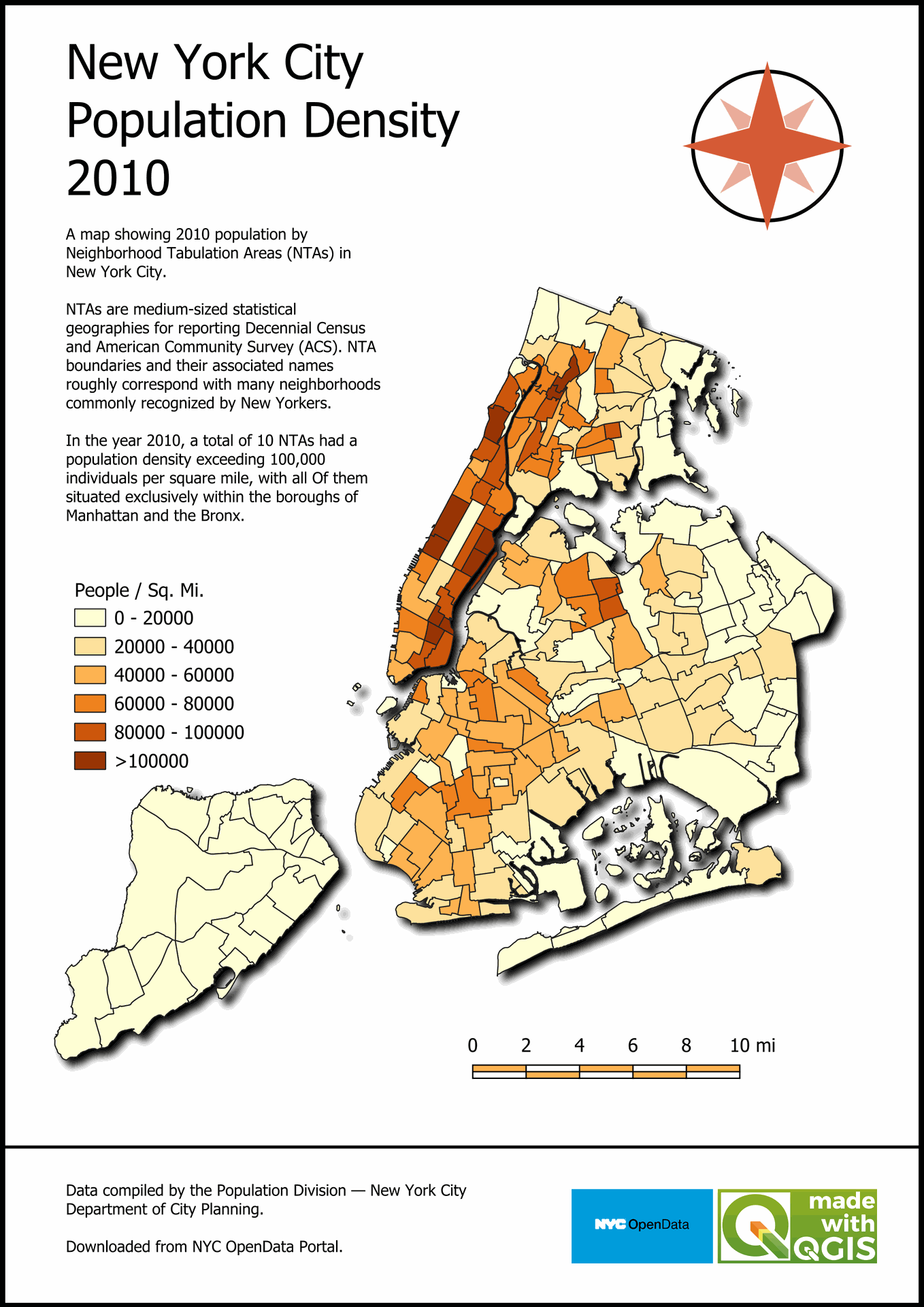
6. New York in 2010: A Peek at Population Density
Revisited the population density of NYC in 2010, providing insights into urban growth patterns and resource allocation, an essential tool for urban planners and demographers looking to optimize city living conditions.
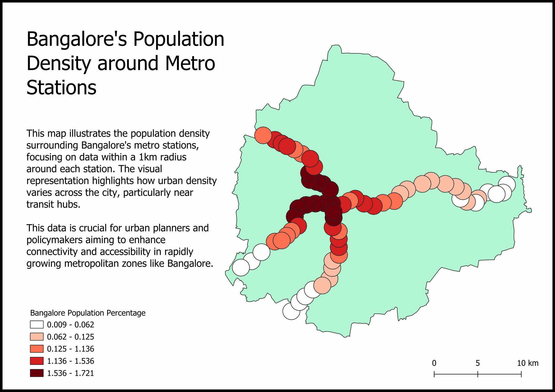
7. Bangalore’s Metro Stations and Population Density: What the Numbers Reveal
Explored the intricate relationship between Bangalore’s metro stations and its population density, helping to pinpoint areas in need of transportation expansion. This project provided actionable insights for public transport planning.
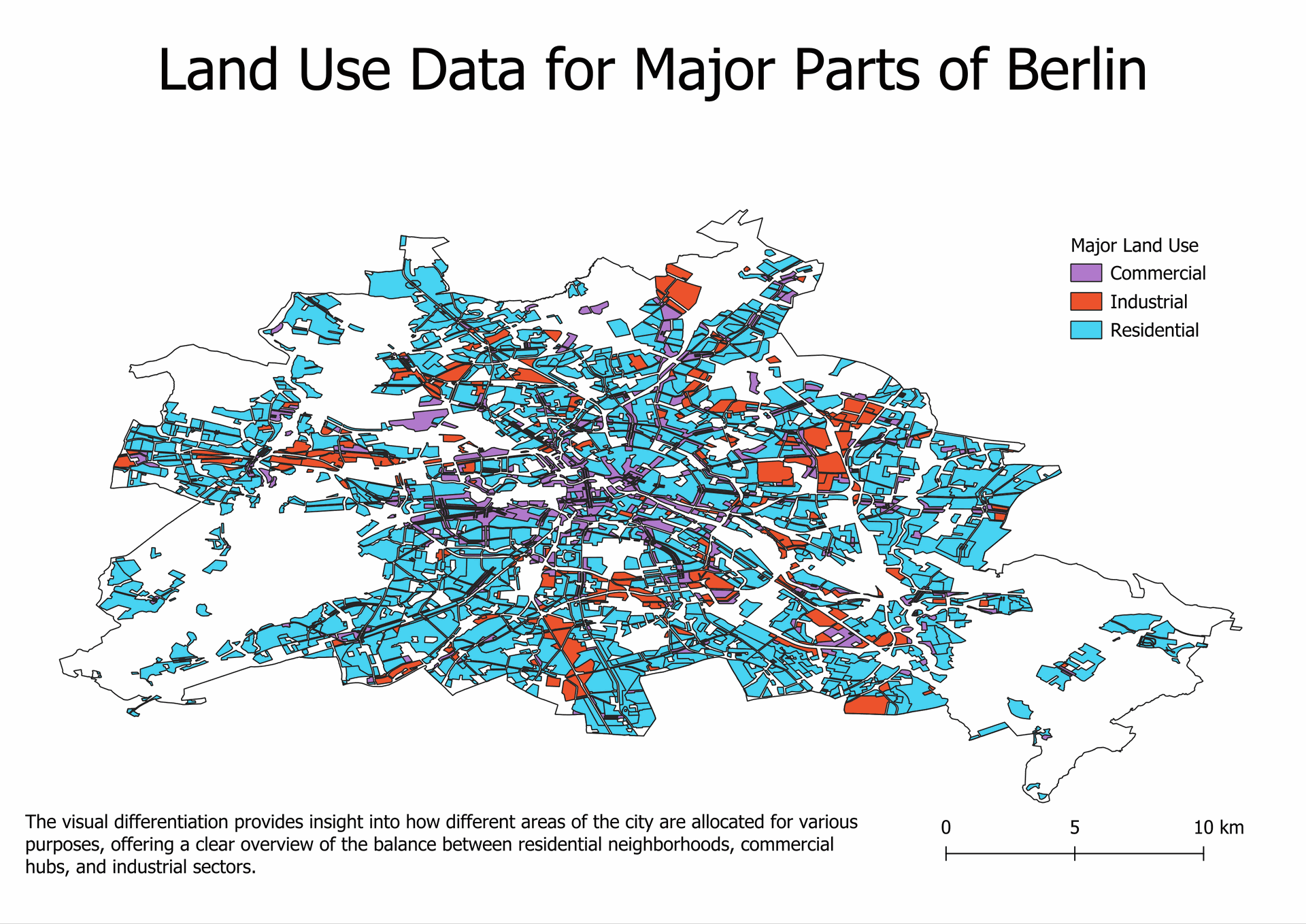
8. Berlin Unveiled: Land Use Patterns in Major Areas
Visualized Berlin's land use patterns—residential, commercial, and industrial—across major regions, presenting data that supports sustainable city planning. These findings were shared with urban development stakeholders.
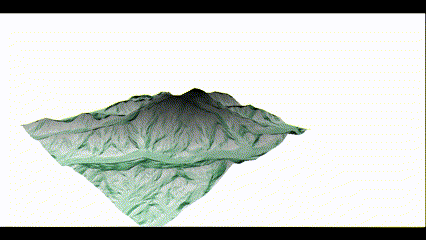
9. Denali in 3D: A Deep Dive into the Digital Elevation Model
Developed a 3D terrain model of Denali, North America’s tallest peak, enhancing geographic understanding and promoting educational tools in physical geography. This model made high-altitude topography more accessible to the public.
These projects were not just about data visualization—they were about making information accessible, actionable, and impactful. By combining technology with human-centric research, I aimed to contribute to real-world challenges like climate change, urban planning, and infrastructure development. The insights gained from these visualizations continue to support informed decision-making and inspire sustainable solutions, proving that data, when used effectively, has the power to shape a better future.
All these Projects at One Place!
9
Projects with Diverse Backgrounds
25+
Hours Invested in this Activity